graph-tool's visualization is pretty good
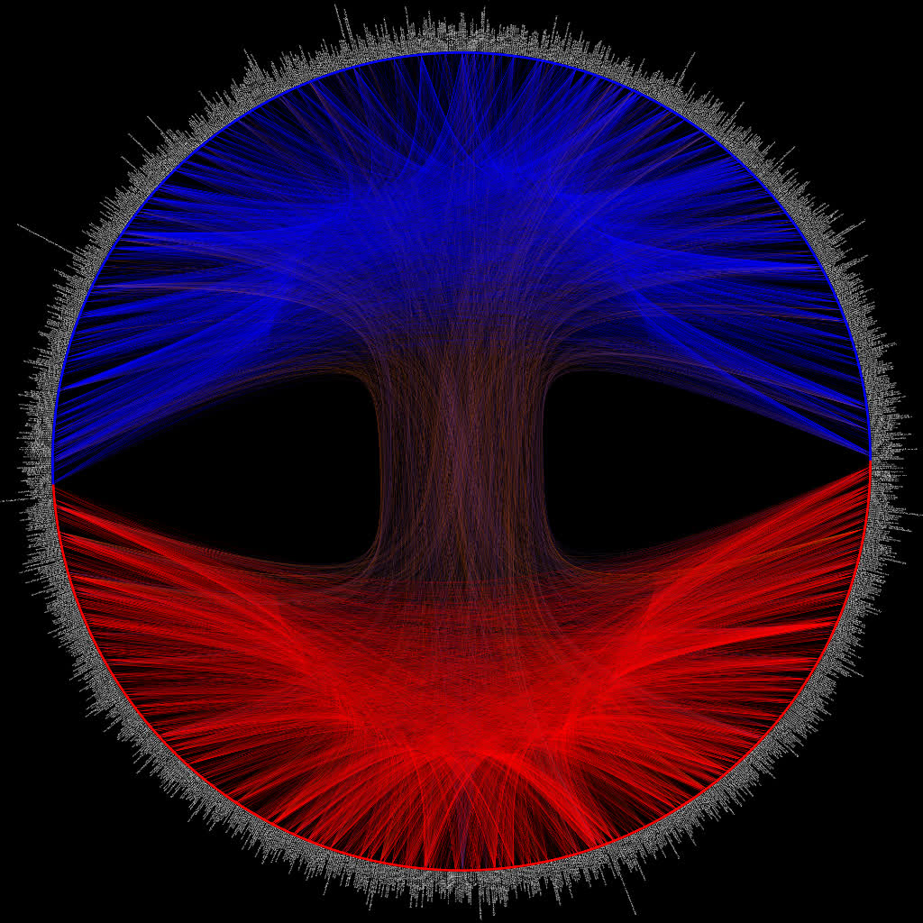
Here’s a plot of the political blogging network described by Adamic and Glance in “The political blogosphere and the 2004 US Election”. The layout is determined using graph-tool’s implementation of hierarchal edge bundles. The color scheme is the same as in the original paper, i.e. each node corresponds to a blog url and the colors reflect political orientation, red for conservative, and blue for liberal. Orange edges go from liberal blogs to conservative blogs, and purple ones from conservative to liberal (cf fig. 1 in Adamic and Glance). All 1,490 nodes and 19,090 edges are drawn.
The url of each blog is drawn alongside each node, here’s a close-up:

This dataset is fairly well-known (it even comes packaged into graph-tool, cf. the below snippet).
import graph_tool.all as gt
import math

g = gt.collection.data["polblogs"] #  http://www2.scedu.unibo.it/roversi/SocioNet/AdamicGlanceBlogWWW.pdf
Getting the colors right requires a bit of tuning:
#use 1->Republican, 2->Democrat
red_blue_map = {1:(1,0,0,1),0:(0,0,1,1)}
plot_color = g.new_vertex_property('vector<double>')
g.vertex_properties['plot_color'] = plot_color
for v in g.vertices():
    plot_color[v] = red_blue_map[g.vertex_properties['value'][v]]
In order to use the hierarchical edge bundling algorithm we first need to do some kind of clustering. The obvious method is to assign each node a cluster based on its political affiliation:
#build tree
t = gt.Graph()

#add verticies with same idx as G
for v in g.vertices():
    tv = t.add_vertex()

#add hierachy points
reps = t.add_vertex()
dems = t.add_vertex()
root = t.add_vertex()
t.add_edge(root,reps)
t.add_edge(root,dems)

#assign clusters based on political affiliation
for tv in t.vertices():
    if t.vertex_index[tv] < g.num_vertices():
        if g.vertex_properties['value'][tv] == 1:
            t.add_edge(reps,tv)
        else:
            t.add_edge(dems,tv)
The clusters are used to form a hierarchy which allows one to easily figure out a standard tree layout (pictured below). Hierarchal edge bundles are drawn by interpolating along the tree.
tpos = pos = gt.radial_tree_layout(t, t.vertex(t.num_vertices() - 1), weighted=True)
cts = gt.get_hierarchy_control_points(g, t, tpos)
pos = g.own_property(tpos)
Here’s the tree used for the above figure:

Finally, we set the text rotation and save the figure:
#labels
text_rot = g.new_vertex_property('double')
g.vertex_properties['text_rot'] = text_rot
for v in g.vertices():
    if pos[v][0] >0:
        text_rot[v] = math.atan(pos[v][1]/pos[v][0])
    else:
        text_rot[v] = math.pi + math.atan(pos[v][1]/pos[v][0])

gt.graph_draw(g, pos=pos,
              vertex_size=10,
              vertex_color=g.vertex_properties['plot_color'],
              vertex_fill_color=g.vertex_properties['plot_color'],
              edge_control_points=cts,
              vertex_text=g.vertex_properties['label'],
              vertex_text_rotation=g.vertex_properties['text_rot'],
              vertex_text_position=1,
              vertex_font_size=9,
              edge_color=g.edge_properties['edge_color'],
              vertex_anchor=0,
              bg_color=[0,0,0,1],
              output_size=[4024,4024],
              output='polblogs.jpg')
The high-res (~18.6 MB) version is available here. Next step is to try this out with some more interesting data.